Yesterday, 11th November, Microsoft officially unveiled their first Microsoft Lumia – Microsoft Lumia 535 It has the same design like most other Lumia’s, the biggest difference of all is the name. No more Nokia! I have been using Nokia phones like forever. At first I didn’t think the logo would make a difference. I love everything Microsoft so I thought I wouldn’t have any problems. But the Microsoft logo on a Lumia, at least for me, is really a no no.
I’m looking at my Lumia 1520 and am glad there isn’t Microsoft. First of all, Nokia is easier to read than Microsoft and NOKIA is all capitals. Microsoft’s name is camel case. I would have very much preferred to have LUMIA all in capitals. It would almost look the same – i.e. same number of letters and all capitals. And then on the back, I would have the Windows “flag” like on the Surface devices keeping the same style on all Windows devices.
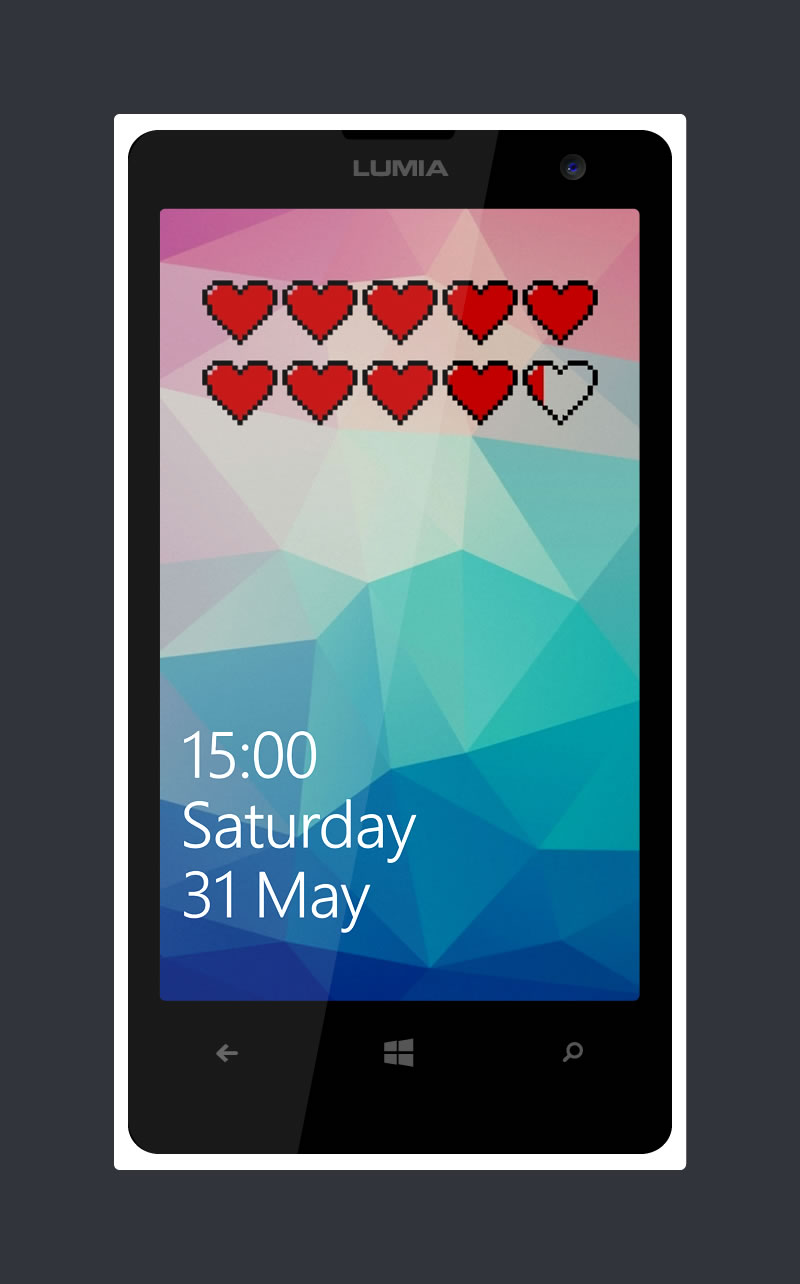
On user voice there is a suggestion to change the name Microsoft to Lumia on Lumia mobile mobiles and I urge everyone to vote (click here)! Look how much better is the LUMIA logo instead of Microsoft, at least that’s what I prefer. What do you prefer – Microsoft or Lumia?
A few Notes:
The app on the front screen of the Lumia is Battery Peek which shows you the amount of battery left on your mobile at a glance in a unique way with various icons from hearts to Super Mario. You can download Battery Peek from here
The PSD used to create the Lumia Windows Phone image is by Janski Wong and you can download from here.


No Responses